Choosing the right color palette for your apartment décor can be difficult, especially if you are a novice interior designer. From neutrals to bolds to hues, it can be overwhelming for you to pick the right color for your new home. This article aims to save you from avoiding common color mistakes with a few simple rules to live by when it comes to picking the right color for your home.
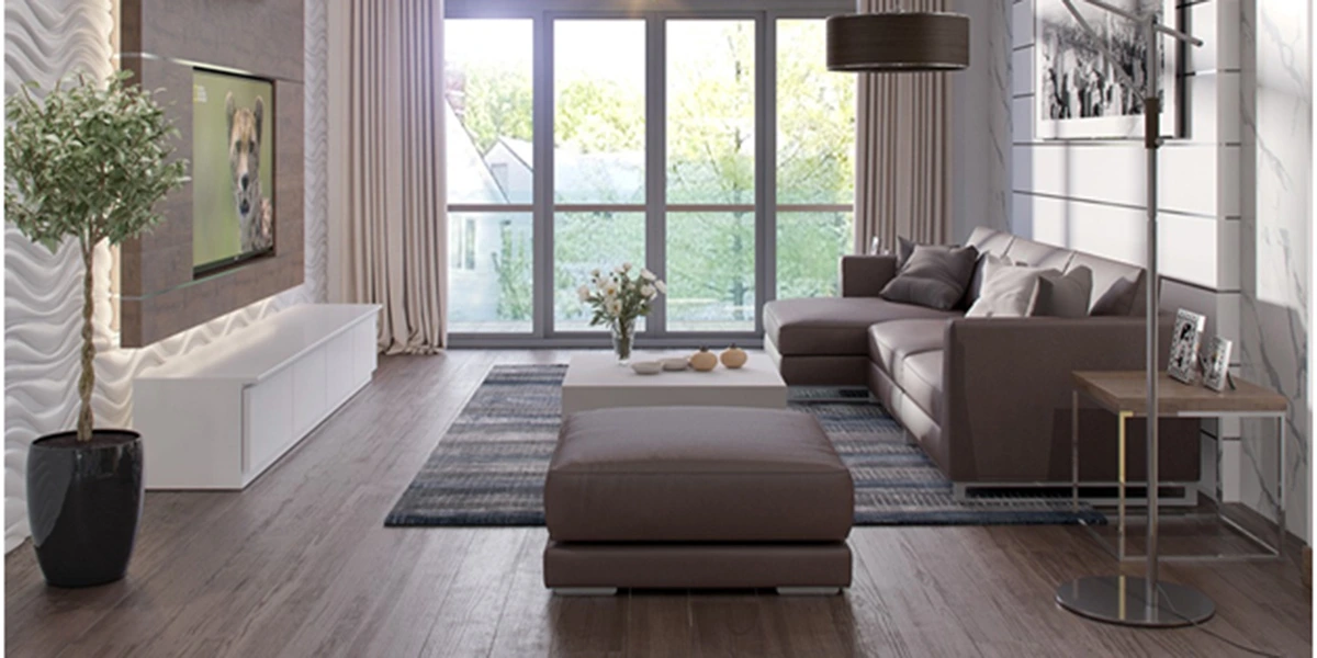
Neutral colors are must have in interior design
Less is more
Although colors are fun, mixing too many colors can create a chaotic mess- “the more the merrier” catchphrase definitely does not add up to an aesthetically color-coordinated apartment décor. If you have made the mistake of applying too many colors in a room, you will notice the ambience does not feel right or peaceful. Interior design experts suggest to avoid using more than four colors in one space. Aim for one or two primary colors (yellow, red or blue) along with a bunch of secondary colors and accents. You should have a ratio of 60 to 30 to 10 with 60 being the dominant color and 10 being the accentuating colors.
Avoid too much matching
Another mistake in choosing colors for your home décor is to mix and match everything. While you should not overdo using multiple colors, limiting yourself to a monochromatic décor is also not very aesthetic. Keep a variety of colors- it will create a sort of surprise in the interior design, making it fun and lively. But again, do not forget the above rule while applying this color decorating tip in your home.
Give the eyes some space to rest
Large or small spaces lavish with bold colors can make you feel at unrest. Make sure your interior design are balanced when it comes to color coordination, such as place a large, plain vase against a colorful backdrop or paint a monochromatic corner behind colorful upholstery. This way you will find a cohesive balance in your apartment interior design.
Consider lighting and space
When choosing a color, consider how the color will vary in different lighting and spaces. Although most homes rely on artificial light, natural light plays an important role too. For instance, if your apartment does not receive ample day light, choose colors that are bright and the same goes for selecting colors when you live in a small sized apartment. Bright colors tend to open up space and make the room feel brighter and bigger. Neutrals like grey or white are good choices for dark spaces and create a visual flow whereas dark colors can create a dramatic flair if you own a luxury condo. For creating an aesthetic design, you can add wainscoting or moldings, applying colors of the same hue but different saturation to create contrast. These little modifications are great tools for adding texture and depth.
Hopefully, with the above rules you can avoid making the same common color mistakes and live in a home whose color makes you feel lively, cheerful and most importantly- right at home. For more design inspiration you can consult bti interior solutions.